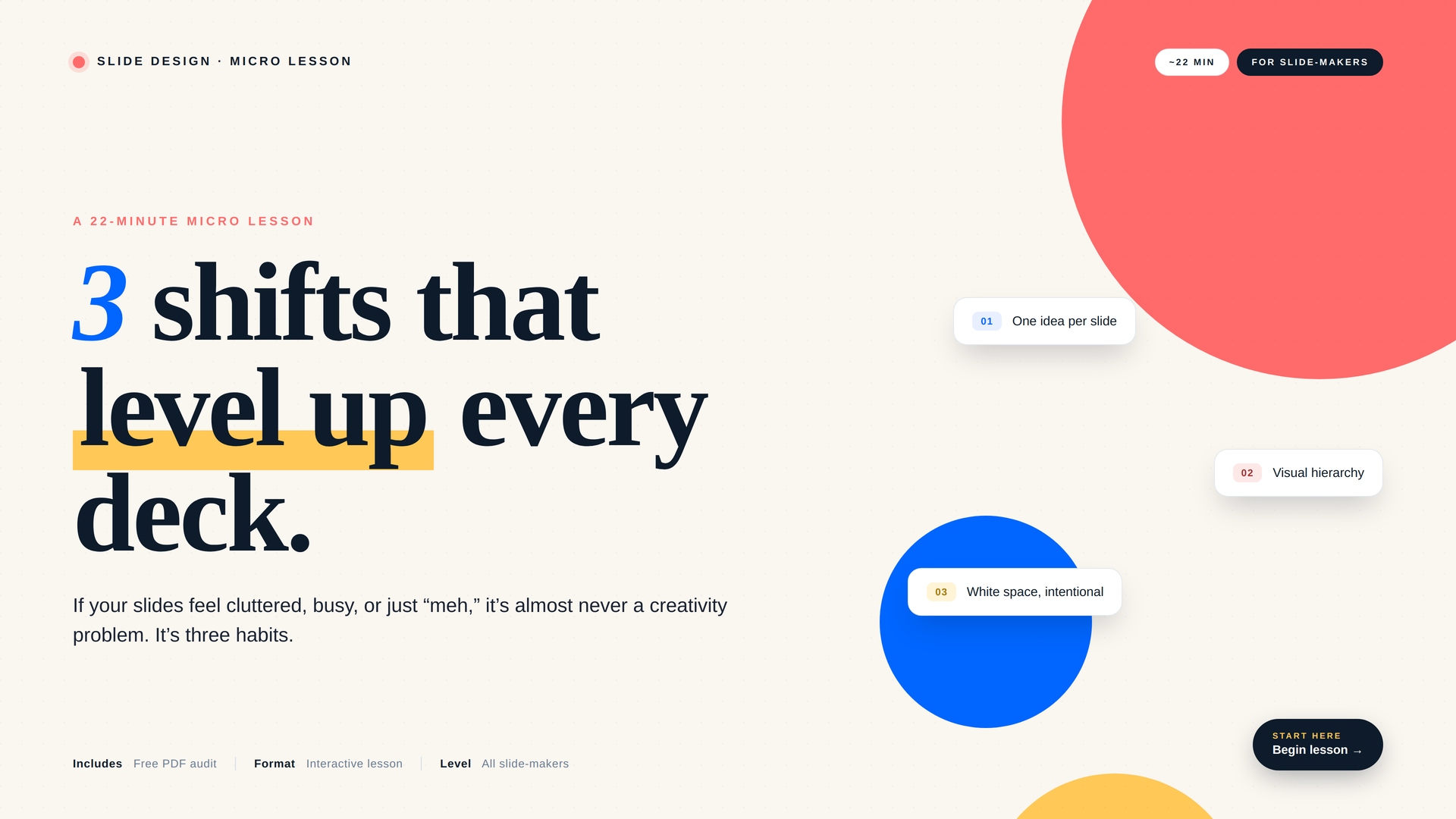
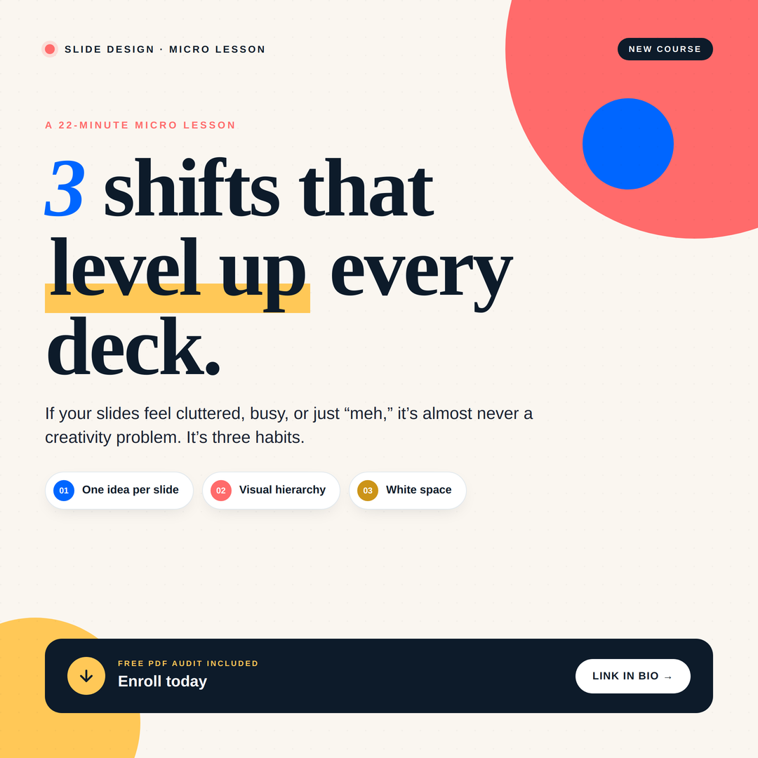
This 22-minute micro-lesson teaches you the three design shifts that make every slide stronger: one idea per slide, clear visual hierarchy, and intentional white space. You'll see them in action with before/after examples and walk away with a printable audit you can use forever.
-
-
Module 1: One Idea Per Slide
More slides isn't the problem; crowded slides are. Learn how to give every slide a single, clear takeaway so your audience actually remembers what you said.
More slides isn't the problem; crowded slides are. Learn how to give every slide a single, clear takeaway so your audience actually remembers what you said.
-
-
-
Module 2: Visual Hierachy
Your viewer should know where to look in under a second. This module shows you how to use size, weight, and color to lead the eye through every slide in the right order.
Your viewer should know where to look in under a second. This module shows you how to use size, weight, and color to lead the eye through every slide in the right order.
-
-
-
Module 3: White Space
White space isn't empty—it's a frame that gives your content room to land. Learn the ~40% rule and how generous margins make even a dense deck feel calm, confident, and easy to absorb.
White space isn't empty—it's a frame that gives your content room to land. Learn the ~40% rule and how generous margins make even a dense deck feel calm, confident, and easy to absorb.
-
In this 22-minute lesson, you'll learn how to:
Spot when a slide is doing too much, and split it into focused slides that actually land
Use size, weight, and color to guide your audience's eye to what matters most
Apply the 40% white space rule so your slides feel framed, not crammed
Run a 3-question audit on any deck before you present it
Tell good slides from bad ones, and explain exactly why

Note from your instructor, Gayle Bower, M.ED
I want to say something before we dive in: deck design can be genuinely stressful. There's a lot of pressure to make it look right, and everyone seems to have an opinion on what "right" even means. Just like with any kind of design, there are so many valid styles and approaches, and yours is one of them.
What you're about to learn is one method, not the method. These are three shifts I come back to whenever I'm feeling stuck, and they've helped me build more confidence and intention into my work. My hope is that they do the same for you. Take what resonates, set aside what doesn't, and remember: your instincts are part of the process, too.